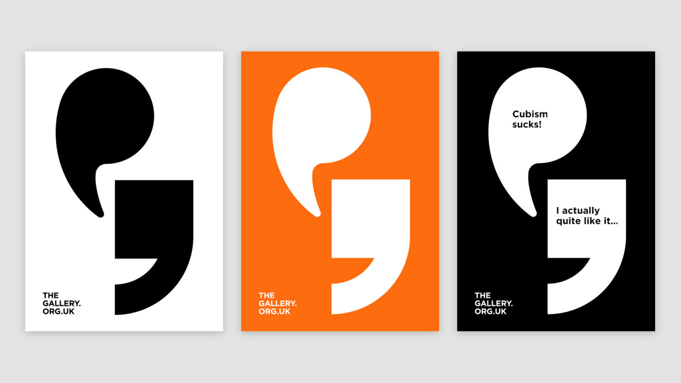
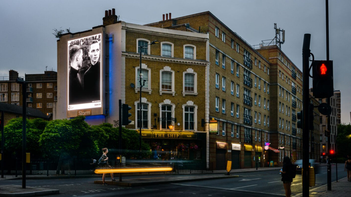
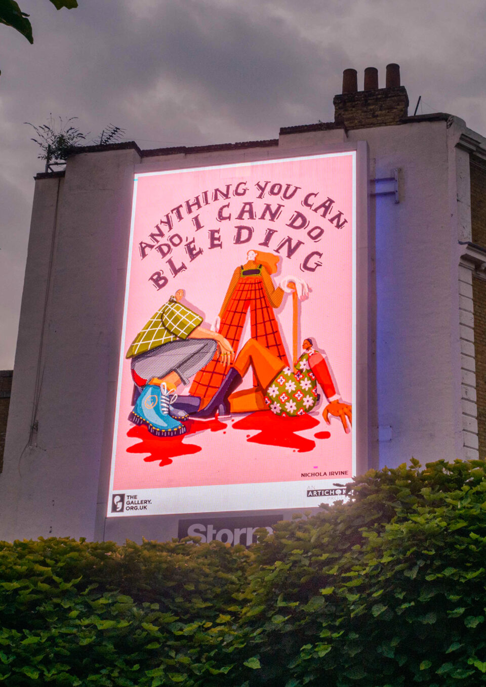
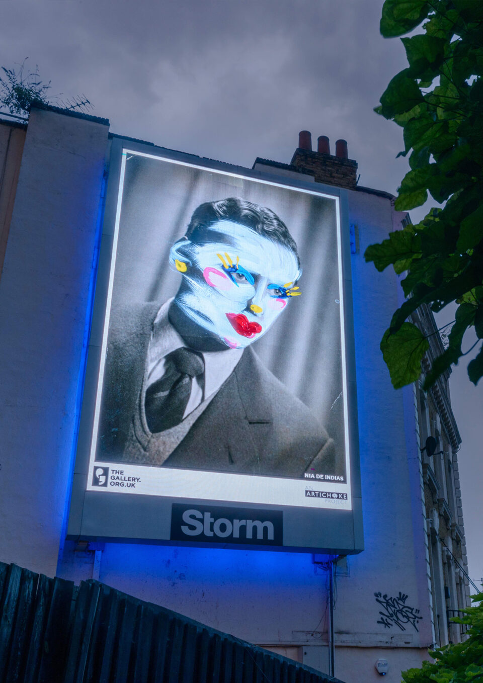
The Gallery
Artichoke

The Gallery is a new type of cultural institution generated by arts events specialists Artichoke, challenging peoples’ perception of art. It’s a gallery without walls, an initiative that works in partnership with the Out-of-Home advertising industry to enable thought-provoking art to be truly accessible across the UK.

The Gallery exists to generate meaningful debate through art about the important questions of our time, bringing thought-provoking art to everyone, twice a year, every year. Seen on billboards and digital screens across all four nations, The Gallery examines urgent topical themes to encourage a national conversation.

Series of three posters featuring the quote marks from the logo. The first poster is black quotation marks on a white background. The second is white quotation marks on an orange background. The third poster is white quotation marks on a black background with the words 'Cubism sucks!' in one quotation mark and 'I actually quite like it...' in the other.

Rather than echo the more usual gallery identities that tend to focus on the art itself, we instead wanted to highlight the aspect of dialogue generated by the art. The combination of two different style quotation marks illustrate the differing opinions stimulated by each image.

A photograph of a London street with a billboard on the side of a pub featuring one of the artworks. The artwork is a photograph of two mid-twenties men standing close to each other.
A photograph of a billboard on the side of a building featuring artwork. The artwork is an illustration with the words 'Anything you can do, I can do bleeding' with an illustration of three women in various poses and cartoon red blood underneath them.
A photograph of a billboard on the side of a building featuring one of the artworks. The artwork is a old-style portrait of a man in a suit. The photograph has been then painted with colourful and contrasting drag-style makeup.

The quotation marks themselves appear in a frame as does the art. It was vital that the public understood that this was not advertising so careful attention was paid to the holding device within the billboards. A simple framing device was key to that idea.

The website was created for use on mobile first as most of the audience would usually be in transit to sites whilst viewing the artwork. Designated urban tours were included to help viewers find all the art from each series within the four capitals of the UK.

Judging by the public response below, the art has certainly started a conversation...

A screengrab from twitter. The caption reads 'Word on the street via @artichoketrust - thegallery.org.uk'. It then featurs a photograph of a billboard with an artwork. The artwork is bold, black and white typography, saying 'Hey straight white men. Pass the Power!'
A screengrab from right-wing news organisation GB News. The headline reads 'Art company behind straight white men pass the power poster given £3million of taxpayers money'. It then featurs a photograph of a billboard with an artwork. The artwork is bold, black and white typography, saying 'Hey straight white men. Pass the Power!'
A screengrab from twitter. The caption reads 'Perfectly normal instruction, spotted in Southwark London. Anybody else spot a backlash coming...?'. It then featurs a photograph of a billboard with an artwork. The artwork is bold, black and white typography, saying 'Hey straight white men. Pass the Power!'

Share