
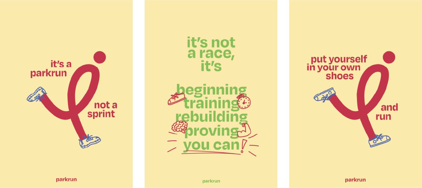
Commended: Eleanor Bonner
Hi I’m Eleanor Bonner, a final year graphic design student at Manchester School of Art. I have always enjoyed creating visual identities and aim to reflect a brand’s core values. I often incorporate illustration into my work to build connection through visual language.
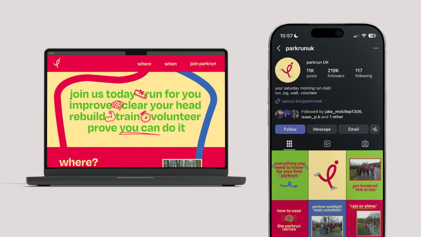
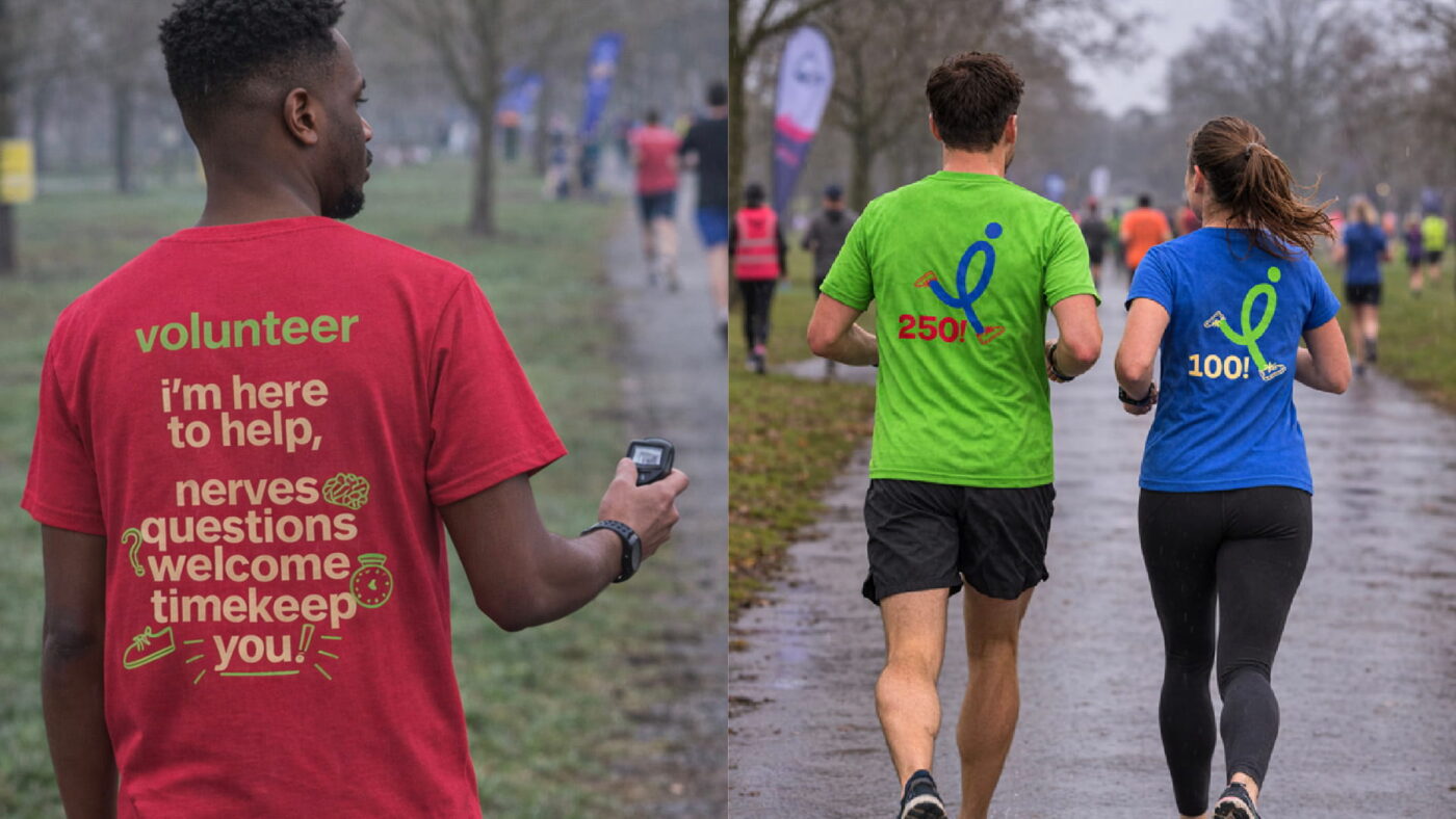
The aim of my project was to create a comforting, encouraging tone of voice to relieve anxieties amongst those scared to begin, as well as show the true community feel of Parkrun. I developed a dynamic visual identity with a bright colour palette to make the experience feel more approachable. The concept centres on celebrating small achievements and highlighting the wider benefits of taking part in parkrun.
Judging notes
We loved the sense of fun that came throughout the Eleanor’s project. The identity was most successful in its playful visuals and strong copywriting – bright and cheery, even with a slightly softer palette than others, the personality comes through the running icon, additional illustrations and copywriting. The tone of voice and playful visuals successfully speak to an audience of potentially socially anxious runners. To reach the next level, we would have liked to have seen a more in-depth exploration of the brand, particularly through digital applications. A more considered web and social presence along exploring how the brand works in motion (The running icon is screaming out to animate!) would move the brand to a fully realised visual identity that could roll out across the vast network that is parkrun. But the strong foundation created with the mark and messaging leaves little doubt in the inviting charm and energy that Eleanor’s project injects into the parkrun world.
AI was used in the creation of some mockups only and wasn’t used in any of the creative.
—

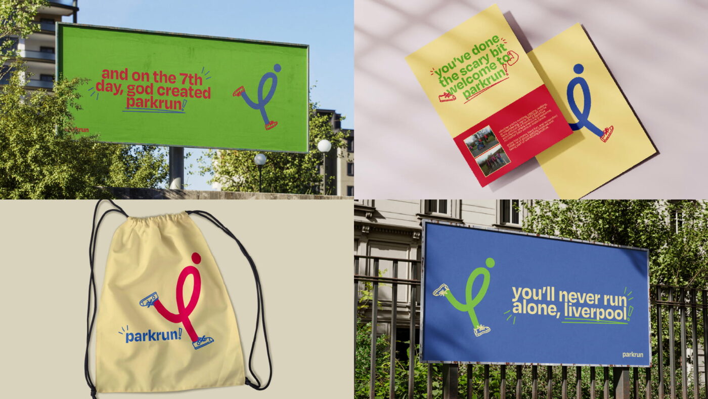
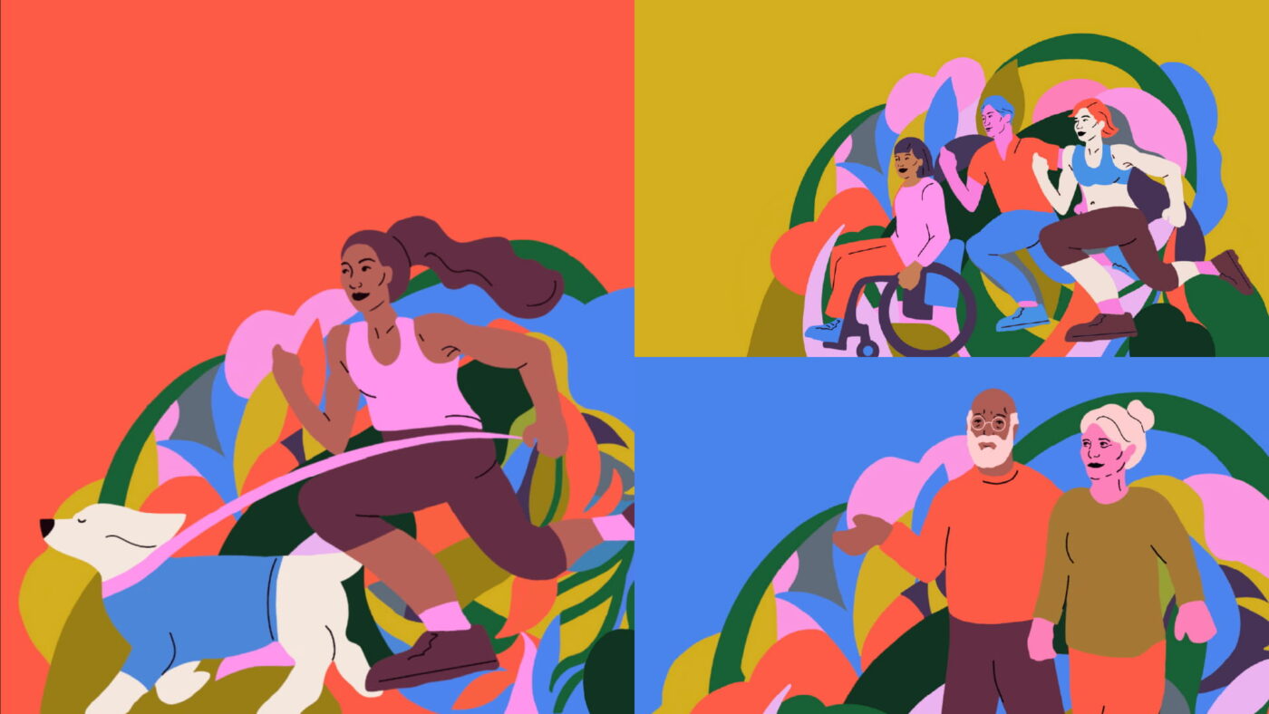
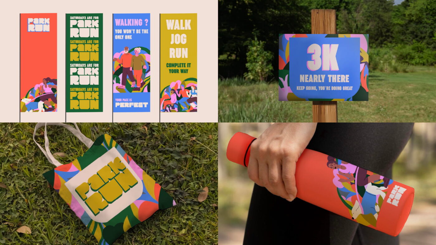
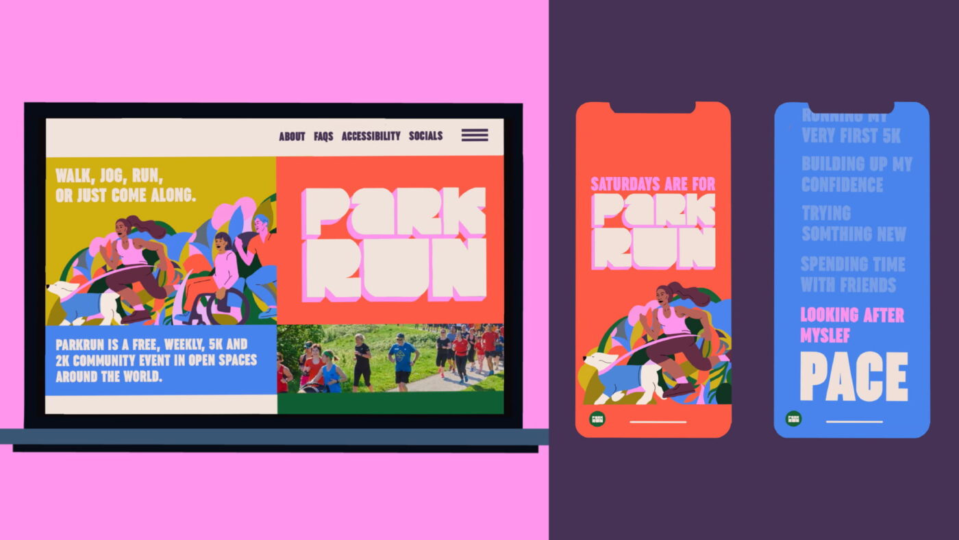
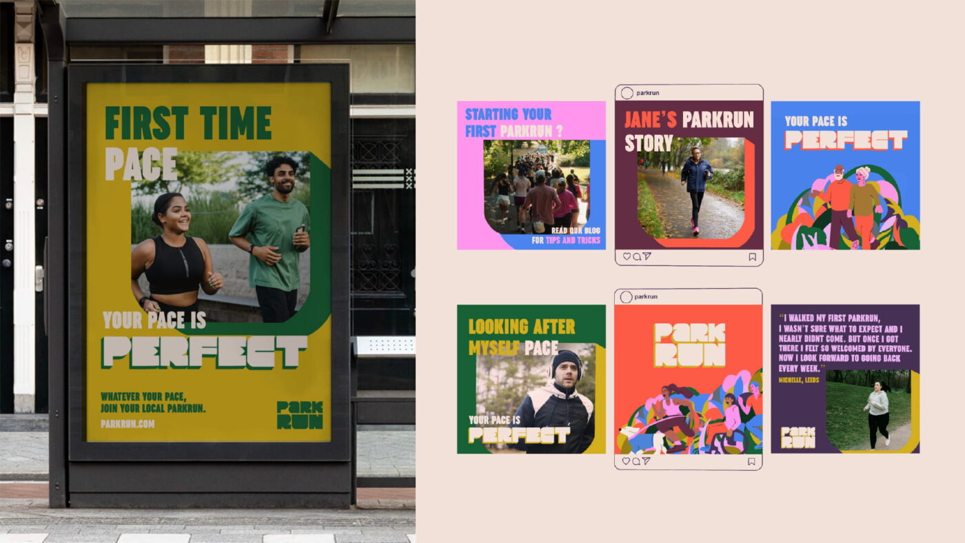
Commended: Poppy McCreary
I’m Poppy, I live in Newcastle upon Tyne and am currently studying Digital Design and Advertising at The Northern School of Art. I have a passion for fine art, specifically pencil drawings which heavily influences my style as a designer. I often incorporate illustrative elements within my campaign designs to add a touch of personality and creativity to projects. I also enjoy blending traditional practices with modern design styles.
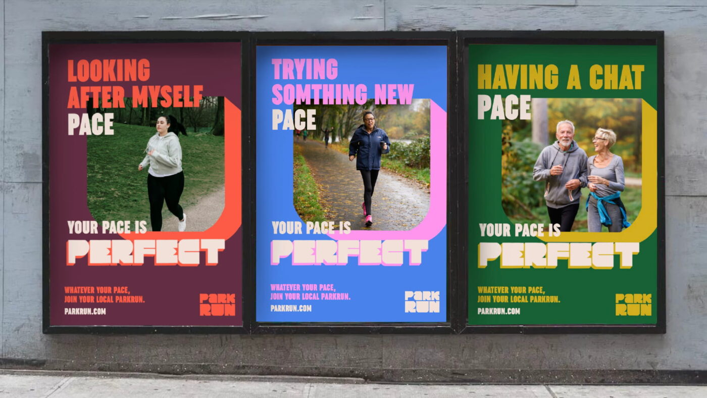
My campaign ‘Your Pace Is Perfect’ encourages new people of all fitness abilities to join their first Parkrun by reframing the idea of performance when running a 5k. Instead of encouraging people to be faster or fitter, it tells them that their pace, whatever that may be, is perfect for a Parkrun. Often people are hesitant to take part in communal fitness activities, for fear of being judged or seen as being too slow or unfit. My campaign creates a more reassuring and welcoming perception of Parkrun and celebrates all ways of moving, ensuring that they can be confident in their ability. Whether it’s walking, jogging, chatting or just showing up, their pace is welcomed.
Judging notes
Bright, bold and full of character, there’s no denying Poppy’s parkrun project stands out from the crowd. We loved the illustration and the use of typography and colour felt like a different approach to creating an inclusive brand. The tone of voice throughout is welcoming and inviting, but certain instances, the copywriting could be refined for a simple, more impactful message. And online, more refined layout across web and social would elevate the identity. With a brand that uses so many arresting elements, balancing the content is important, and often, less is more. On the whole, the bold yet inviting brand that Poppy has created, stood out with its use of colour and illustration to create a strong new vision for parkrun.
No AI was used in this project.
—
To see the Winning project, click here.
Thank you to everyone who submitted their work, we appreciate everyone that took the time to work on and submit their new vision for parkrun. If you fancy taking part in our Student Brief for the next year, keep your eyes on our socials towards September/October as we launch our 26/27 student brief.