
Winner: Manisha Ryatt
Norwich University of the Arts
Hi, I’m Manisha! Born and bred in Leeds, I am an enthusiastic and dedicated individual who loves to explore new methods of creative design. I have a passion for strategy and copywriting as I thoroughly enjoy creating an impactful story through the use of words. I’m a thoughtful designer who takes pride in crafting strong visual work and genuinely enjoys the strategic process behind turning ideas into effective, purposeful solutions. With an energetic personality and a strong drive, I’m committed to making a meaningful impact wherever I go. When I’m not designing you will find me playing sports or exploring the outdoors. I thrive on staying busy and pushing myself to try new things.
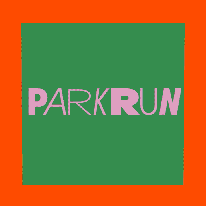
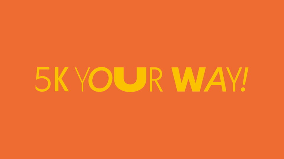
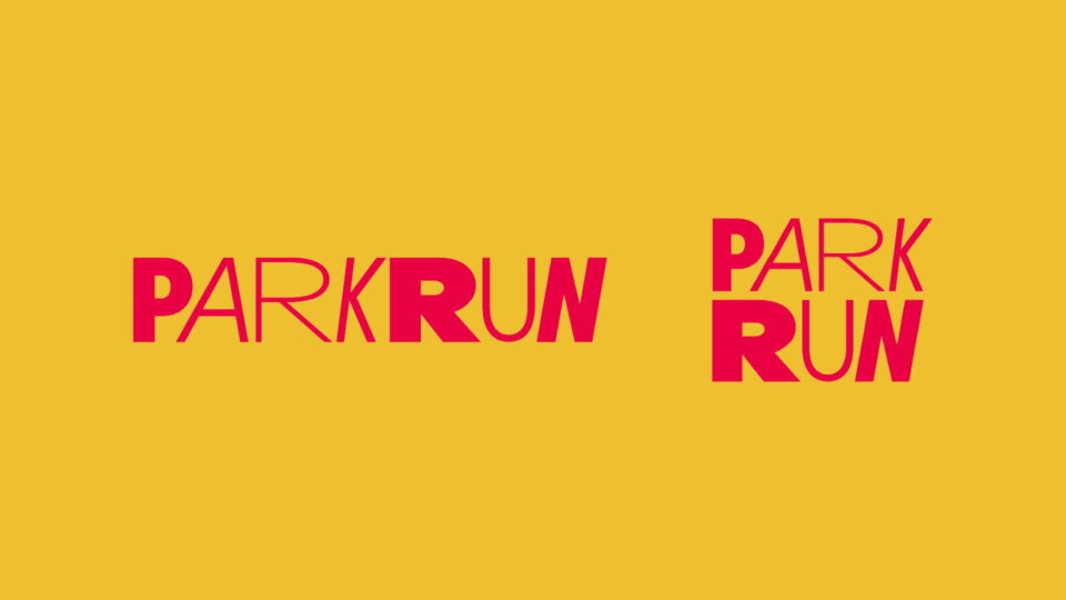
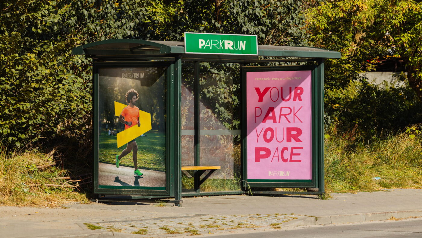
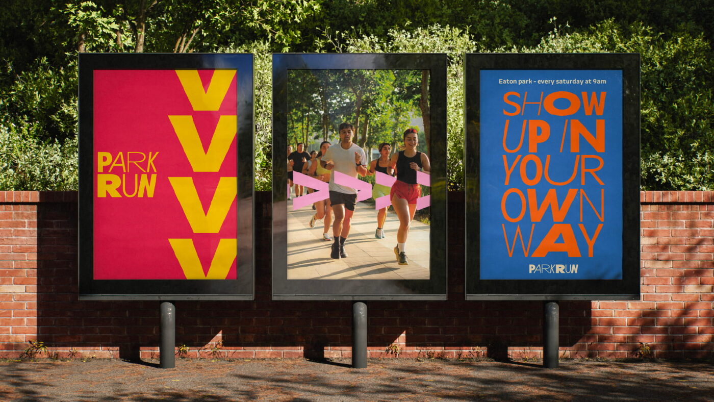
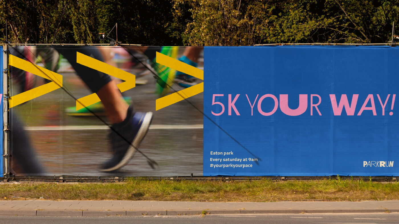
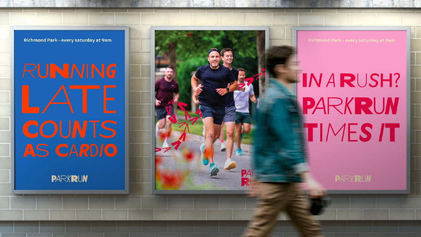
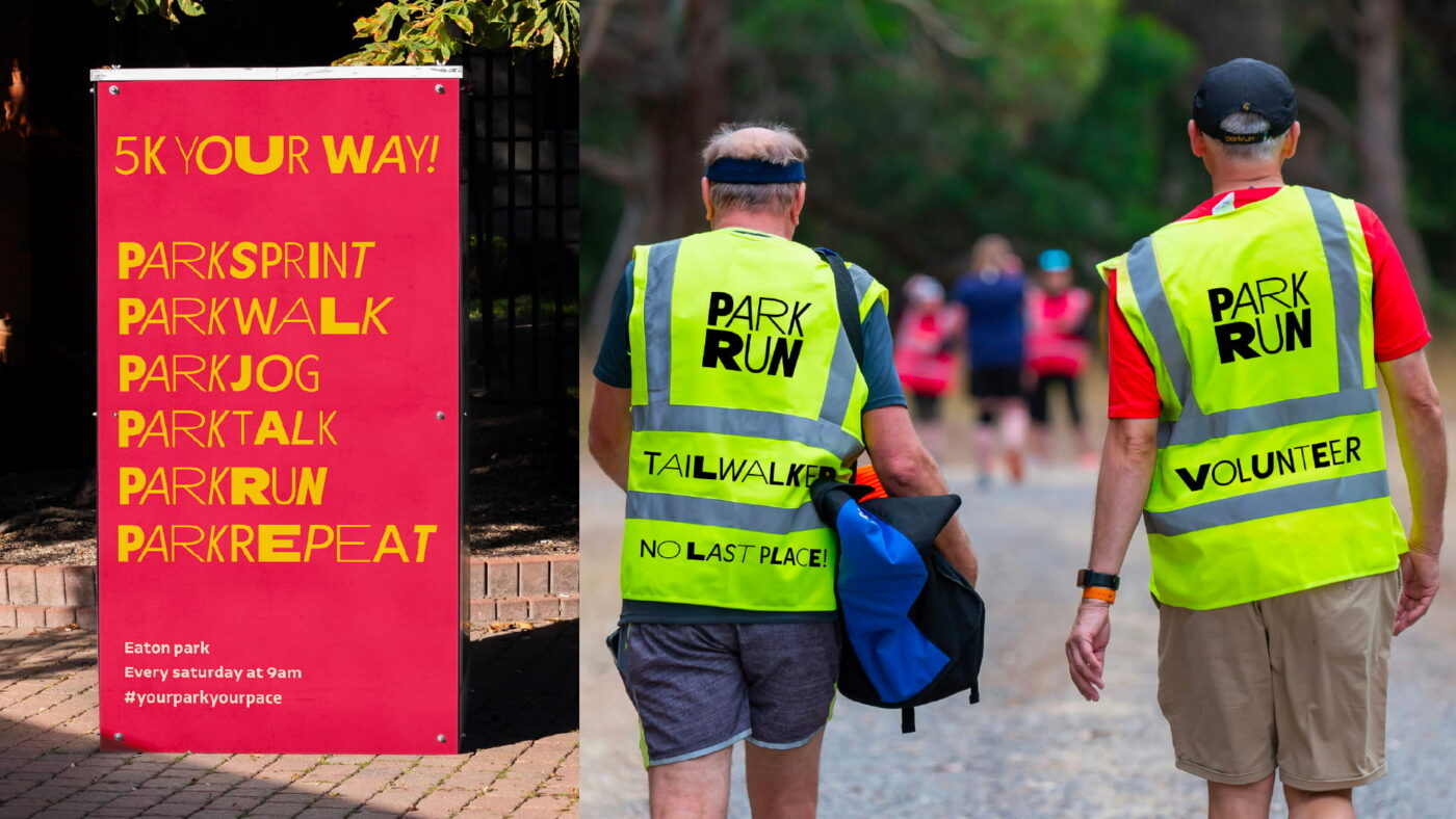
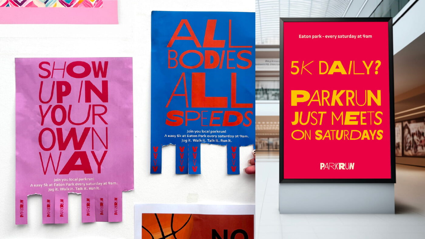
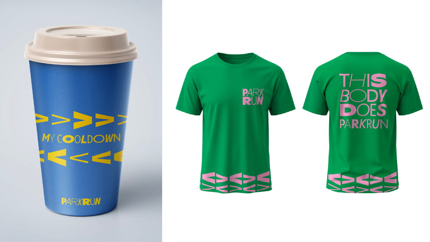
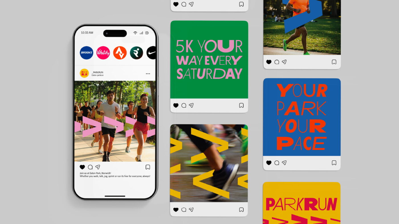
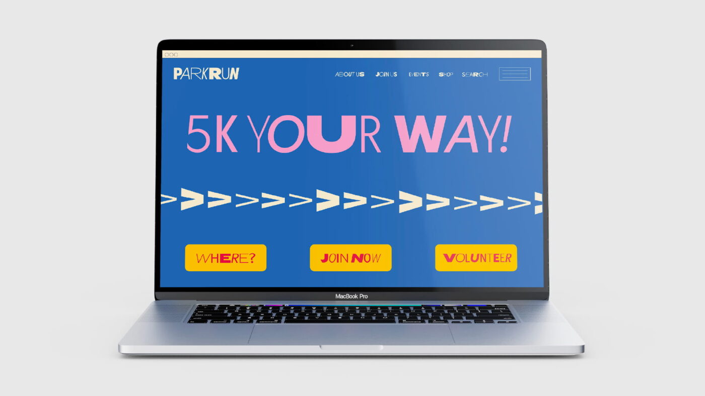
My rebrand for parkrun is simple, bold, and designed to stand out. It introduces a vibrant, dynamic identity that reflects the event’s inclusive spirit. Using a single variable typeface, I created playful, attention-grabbing typography to attract newcomers and energise the weekly experience. The shifting letterforms represent the diversity of participants, coming together as one capturing the global sense of community at the heart of parkrun.


Judging notes
For us, the most important thing will always be the idea. A project without an idea is just wallpaper – decoration without purpose. A successful project for our Student Brief is always going to be idea-focussed. We found Manisha’s typographic-led concept, representing the variable characters that are welcome at parkrun, to be a visual identity that could run and run. The brief called for inclusivity to be embedded within the brand, and through concept, styling, and copywriting, this project was the strongest answer to the brief. It felt the right balance of inclusive yet energetic. Modern but not just trendy. Beyond the initial concept and visual identity, the brand was successfully expanded with good copywriting across print and digital applications. And we were particularly impressed by the level of craft and depth of execution used to demonstrate the visual identity.There are still areas we think this brand could grow and improve – A greater exploration of its social media presence (particularly considering how the brand could live on Facebook, as a lot of events are then primarily through Facebook) and more exploration of the typography in motion, could strengthen the brand through practical application and potential brand extension.But overall, Manisha’s project captures the parkrun spirit and modernises the experience for a new and wide-ranging audience. Utilising typographic expressions across print and motion graphics, it has elevated parkrun from a simple and dated brand into a one bursting with of energy, personality and inclusivity.
No AI was used in this project.
To see the Commended projects, click here.
Thank you to everyone who submitted their work, we appreciate everyone that took the time to work on and submit their new vision for parkrun. If you fancy taking part in our Student Brief for the next year, keep your eyes on our socials towards September/October as we launch our 26/27 student brief.