The Royal Borough of Greenwich appointed The Chase to create the naming, branding and narrative interpretation for the new Woolwich Creative District.
It was a great opportunity for us as we quickly realised that the client team needed something highly creative yet relevant for their vision. Creativity is at the heart of everything we do so being asked to develop a brand for such a prestigious cultural destination was a genuine honour, particularly as we needed to respect the history of the site, the former Royal Arsenal.
Naming
Naming the site was a fairly substantial undertaking as we had to develop a hierarchy which supported the overall vision, were memorable, and conveyed a coherent family group. The task included an overall trading name, the five site buildings, key performance venues, event space names, studio names and service room names.
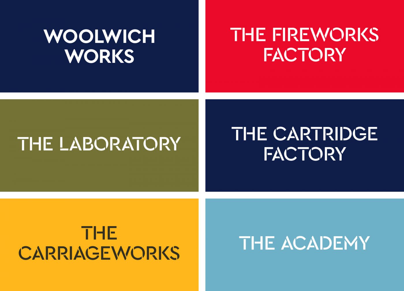
The council’s only stipulation was that ‘Woolwich’ had to be a part of the overall trading name. Woolwich Works was short-listed from an original list of 50 or more suggestions. It was chosen because it alluded to the site’s manufacturing heritage whilst relevant for a modern cultural venue. The alliteration also became an integral part of the visual identity. For the 5 listed buildings we adopted a similar approach, keeping true to the purpose of the original buildings use whilst being appropriate for a modern cultural venue. The Fireworks Factory, The Academy, The Carriage works, The Laboratory and The Cartridge Factory were the final choice.
The Brand Identity
During our research we uncovered that a part of the Royal Artillery insignia was a chevron or zig zag. This was believed to be connected to Saint Barbara, the patroness of the artillerymen, as she was connected with protection against lightening and later explosions. The chevron is also found to indicate rank of course. We also found that the chevron pattern has been used in many cultures across the world as early as the Egyptian period and possibly earlier.
With that in mind we developed a brand device that was universal in every sense and had connections with the Arsenal. We liked the idea of the Woolwich Works initial characters creating the brand device.
Colour
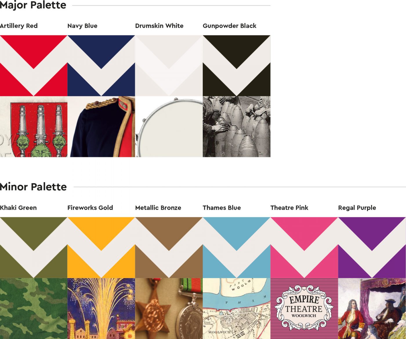
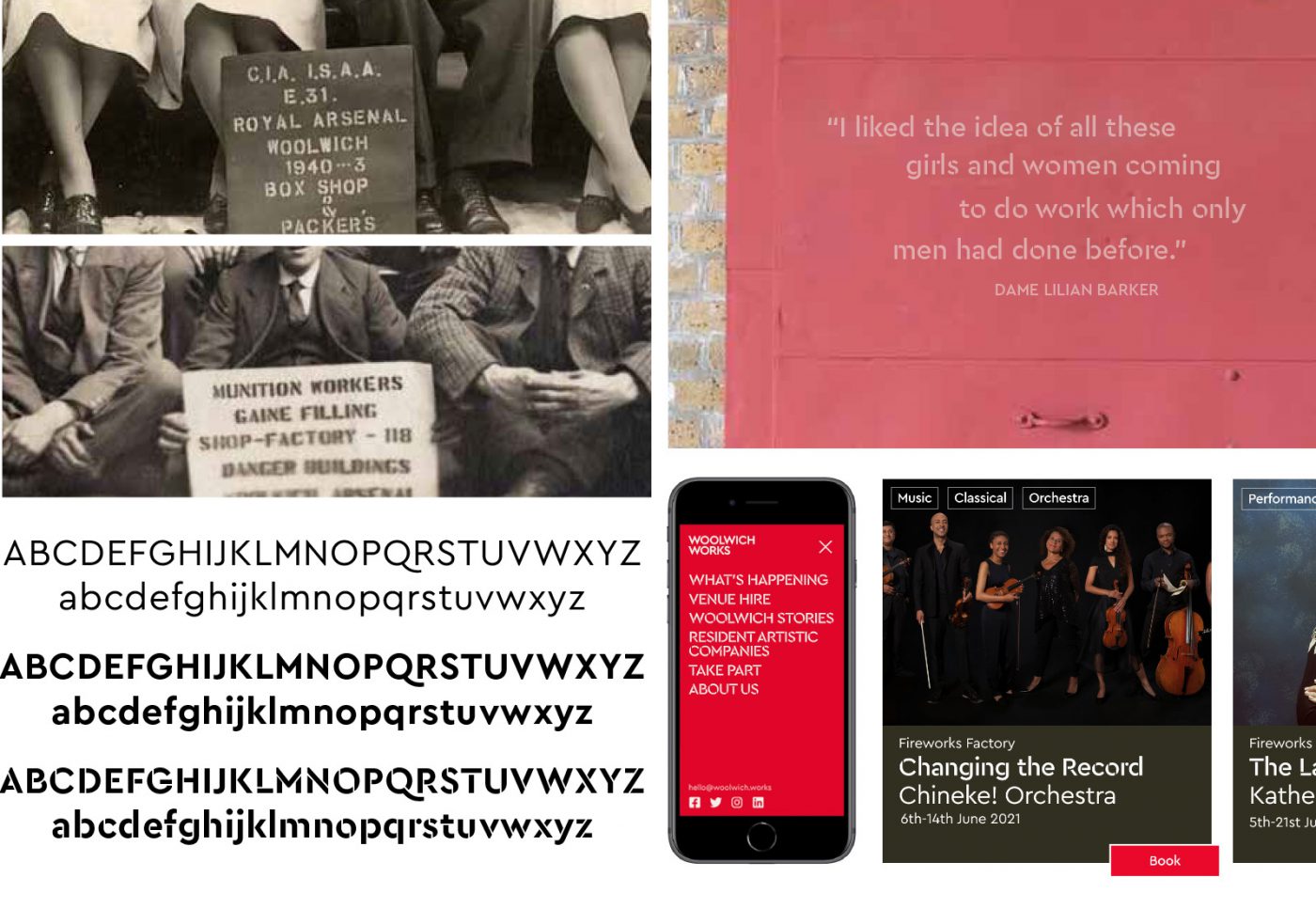
The role of colour is an important one and in this case we felt it had to express the creative nature of the new district, convey accessibility and welcome, have stand out in the sector, relate to the site, aid navigation for visitors within a signage system and complement any supplied and new imagery for marketing communications.
The inspiration for the colour palette came from the historical, geographical and cultural connections of the site. We wanted a vibrant attractive colour palette to contrast with the austere red brick interiors of the buildings. The ‘major’ palette as we called it contained the Navy blue and Red from the Royal Artillery uniforms supported by a range of ‘minor’ colours including a metallic bronze which was inspired by the materials used to manufacture ordnance.
Typography
The role of the typeface for an identity such as this makes the decision all the more important given it has to express the creative nature of the district, whilst creating stand out in a crowded sector. It also had to be accessible and warm. The adaptation to different languages was also another key factor in the decision given the varied demographic of Woolwich. It had to work on screen and in print and aid legibility for signage. Again, we wanted a rational for the choice and based on our research we found that stencil fonts were used extensively particularly during the war years around the site.
The type family chosen for Woolwich Works was Cera Pro. Cera Pro is considered a contemporary geometric typeface and brings simplicity, elegance and a certain warmth. Cera Pro’s six weights, thin to black, give it a full range of expression for interfaces and corporate design; in print, on screen and in multiple languages. It supports around 150 languages and offers a stencilled version which is used as the primary font.
Creative Interventions
As part of the redevelopment of the site, we created a narrative, exploring stories which could be used to enhance and interpret the site. We took the copious material available about the history of the buildings and turned them into a narrative strategy. This narrative became a clear story and part of the detailed design of the buildings so that whoever visits or uses them can understand them and their context.
Rather than focussing on what had been manufactured, the stories were focussed on the people connected with the site and their influence. As you would imagine, covering such a broad history, the stories collected were varied and compelling. They covered all subjects – from the ‘Canary Girls’ (the nickname given to those female wartime munitionettes working with toxic material which turned their skin yellow!) to George Frideric Handel and the commissioning of the Music for the Royal Fireworks.
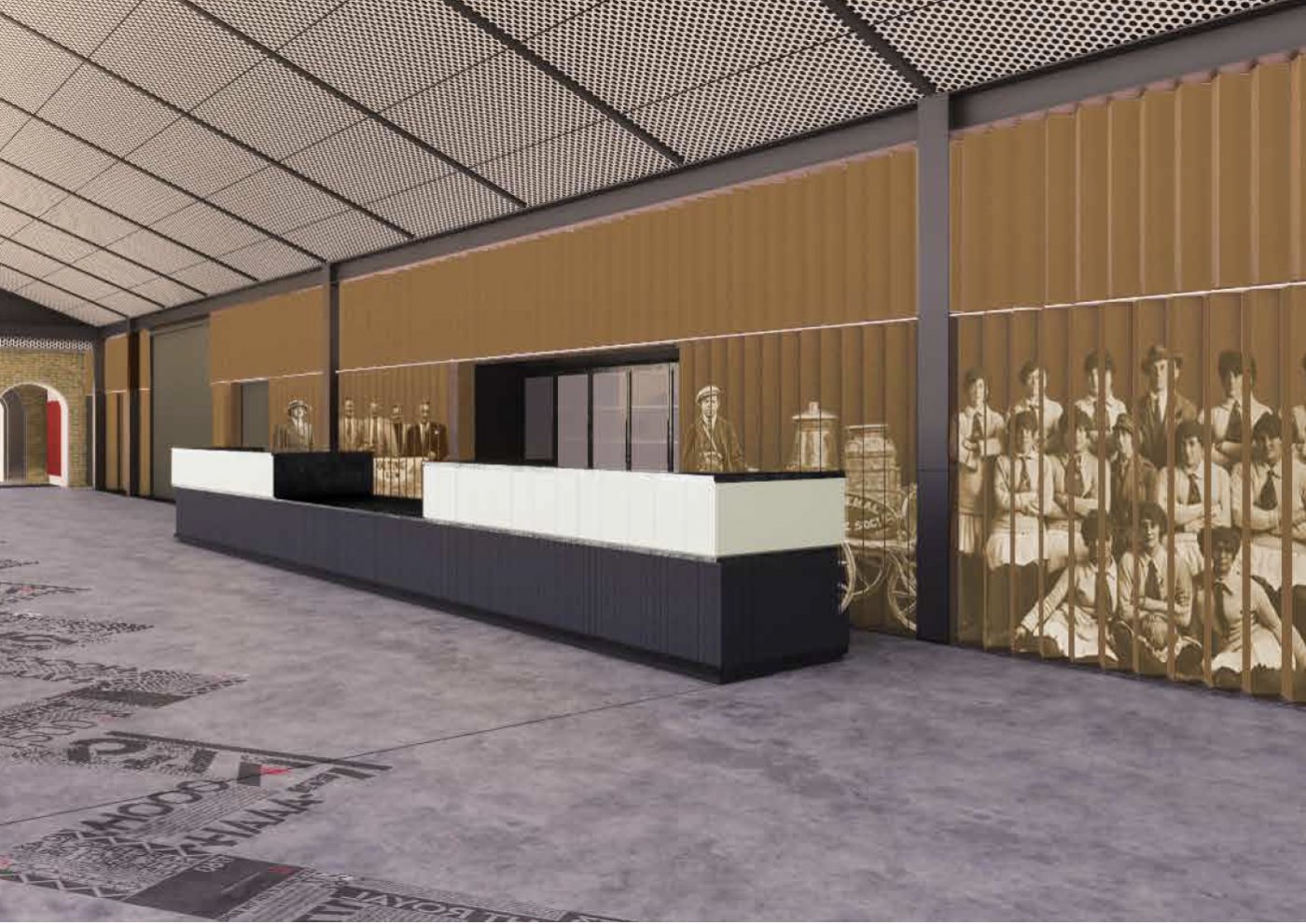
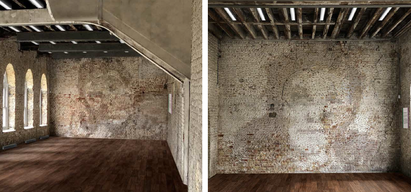
Each story selected was given its own space within the Fireworks Factory but more importantly being featured as part of the fabric of the building. This meant exploiting the wall and floor surfaces rather than creating standalone pieces which may interrupt the events taking place in the future.
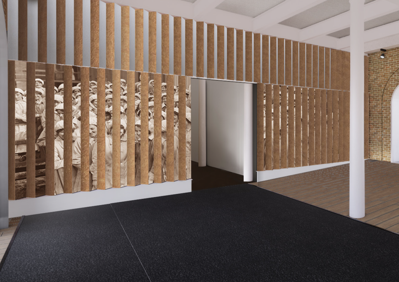
The Munitionettes
The munitionettes in the main foyer. The image will be applied on vertical corrugated chevron profile walls. It works as a lenticular image in that it can only be viewed from one side.
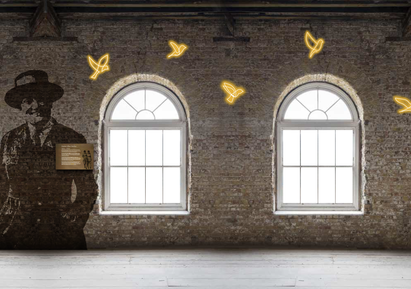
Lilian Barker Gallery
Lilian Barker and the Canary Girls within a gallery. Lilians’ portrait is painted directly onto the brickwork whilst the ‘Canary Girls’ are acknowledged in flight as neon designs.
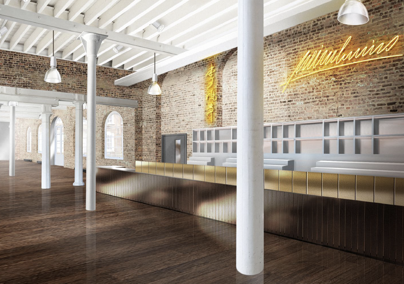
Visitor’s Book Café
The Visitor’s Book Café featuring dignitaries who visited the site. Each name will be shown as a bright neon signature which will correspond to the Visitor’s Book Café menu.
Knight Gallery
The Knight Gallery featuring Eliza and Donald Knight. They were an inspirational couple. Eliza was a suffragette and imprisoned for political activism. Donald pulled a case of exploding rockets out of a depot, saving many lives and received the George V medal for bravery.
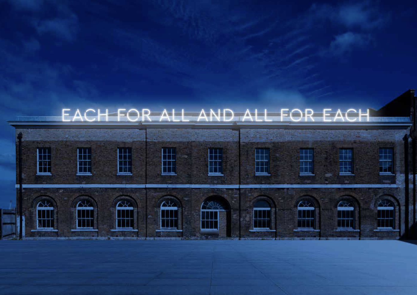
Workers’ Yard
The Workers’ Yard featuring a Woolwich Co-operative movement motto capturing the spirit of the project.
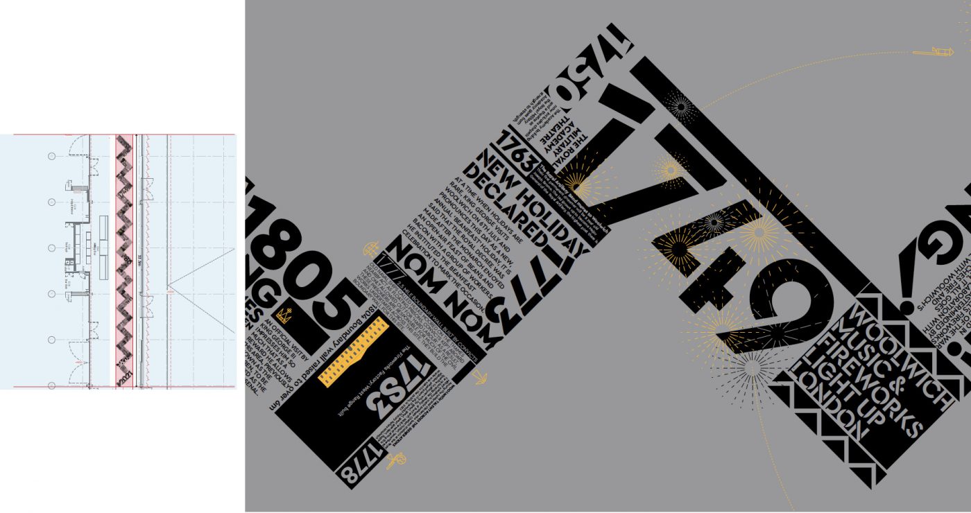
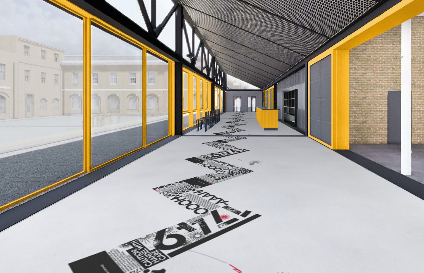
Woolwich Works Timeline
A chronological timeline set out in a large-scale chevron that runs the full length of the milling foyer, 33 metres in length. It’s a typographic essay of the entire history of the site.
Selling the spaces
Our creative brief was to show how the spaces might be used without having access to shoot on site due to ongoing renovations. Our approach was to take existing footage of the buildings and overlay imagery of performers and artists acting within the spaces.

